![cover of episode [Linkpost] “Histograms are to CDFs as calibration plots are to...” by Optimization Process](https://files.type3.audio/lesswrong/cover-art-30-karma-v2.jpg)
[Linkpost] “Histograms are to CDFs as calibration plots are to...” by Optimization Process
LessWrong (30+ Karma)
Shownotes Transcript
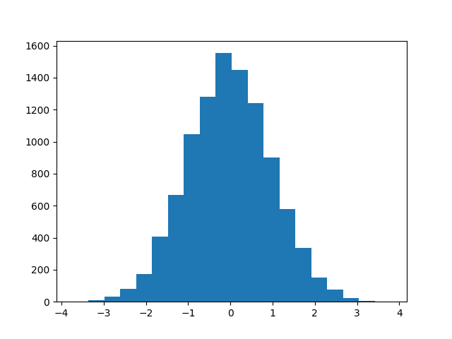
This is a link post. As you know, histograms are decent visualizations for PDFs with lots of samples... 10k predictions, 20 bins
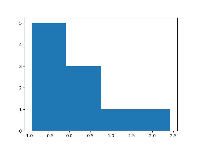
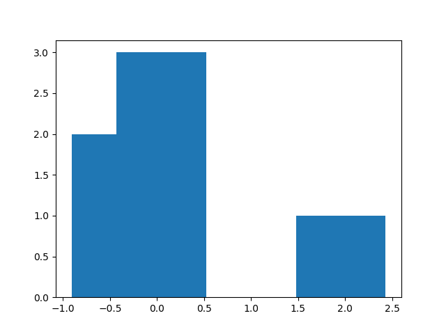
...but if there are only a few samples, the histogram-binning choices can matter a lot: 10 predictions, 4 binssame 10 predictions, 7 bins The binning (a) discards information, and worse, (b) is mathematically un-aesthetic.
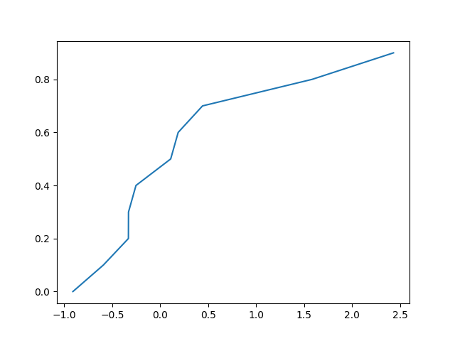
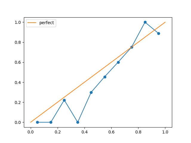
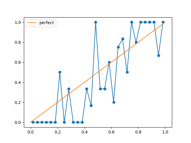
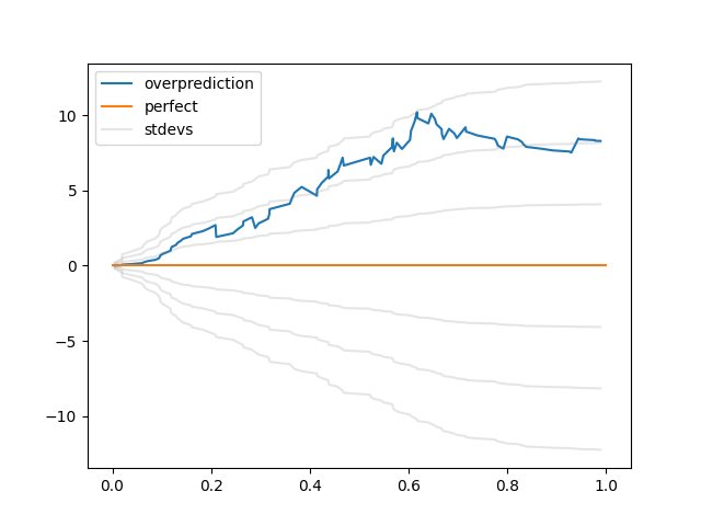
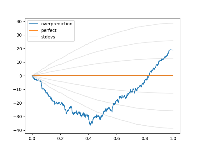
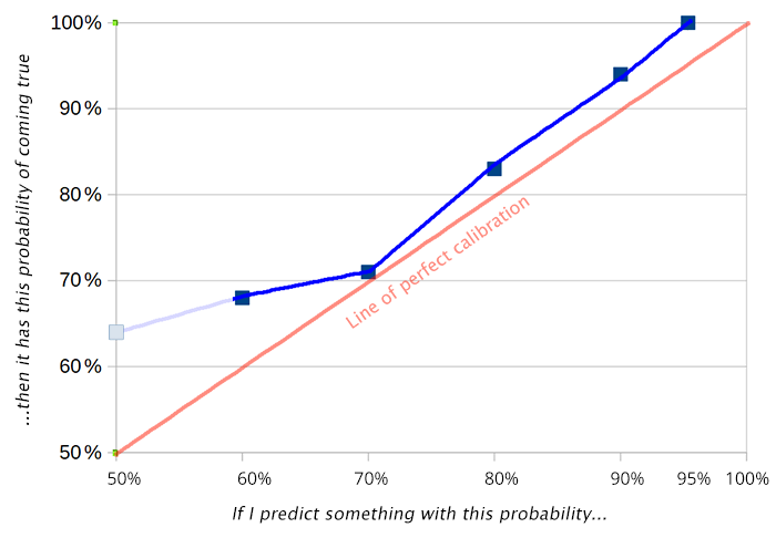
But a CDF doesn't have this problem! same 10 predictions, every data point precisely represented If you make a bunch of predictions, and you want to know how well they're calibrated, classically you make a graph like this: source: SSC's 2019 prediction grading But, as with a histogram, this depends on how you bin your predictions. 100 predictions, 10 binssame 100 predictions, 30 bins Is there some CDF-like equivalent here? Some visualization with no free parameters?
I asked that question to several people at Arbor Summer Camp. I got three answers:
- "You get from a PDF to [...]
First published: June 5th, 2025
Source: https://www.lesswrong.com/posts/LFGgwitjertJqch7J/histograms-are-to-cdfs-as-calibration-plots-are-to)
Linkpost URL:https://optimizationprocess.com/calibration-cdf/)
---
Narrated by TYPE III AUDIO).
Images from the article:
 )
) )
) )
) )
) )
) )
) )
) )
) )
Apple Podcasts and Spotify do not show images in the episode description. Try Pocket Casts), or another podcast app.
)
Apple Podcasts and Spotify do not show images in the episode description. Try Pocket Casts), or another podcast app.